Appearance
Colors
Introduction
The color palette is a key element of the design system. It consists of a set of named colors. Its used consistently to create a visual hierarchy, establish a brand identity, and ensure accessibility.
Consistently using colors from the color pallette enables the possibility to create different themes for the Codey Library.
This helps in serving not only Xerius but also My Family and other clients, as well as enabling dark variants of themes.
To achieve this the colors are setup as the diagram shows below:
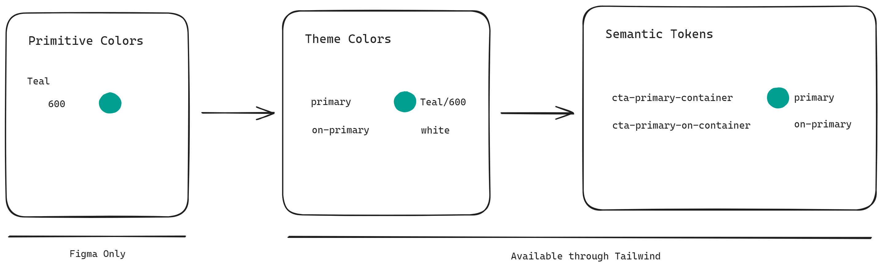
There is a hard distinction between the two groups:
- Primitive Colors: The color pallette where all used colors are defined. This pallette holds absolute color values. Solely managed by our designers.
- Theme Colors and Semantic Tokens: defined as a reference to the Primitive Colors. This way, these pallettes can be changed to apply a different theme.
To allow easy utilization of the Theme Colors and Semantic Tokens we provide them through tailwind, for example:
- to set the text color of an element to the brand color, you can use
text-brand. - to use the brand color as arbitrary value you can use
var(--color-brand).
Tailwind color showcase
B
base
base-emphasis
base-interaction
base-inverse
base-inverse-emphasis
base-inverse-transparent-emphasis
base-inverse-transparent-interaction
base-tinted
base-transparent
base-transparent-emphasis
base-transparent-interaction
brand
brand-emphasis
brand-graphic
brand-interaction
brand-tinted
brand-tinted-empasis
C
color-backdrop
D
danger
danger-emphasis
danger-interaction
danger-tinted
danger-tinted-emphasis
disabled
disabled-transparent-inverse
I
info
info-emphasis
info-interaction
info-tinted
info-tinted-emphasis
info-transparent-emphasis-10
info-transparent-emphasis-20
O
on-base
on-base-accent
on-base-de-emphasis
on-base-emphasis
on-base-inverse
on-base-muted
on-base-subtle
on-base-tinted
on-base-transparent
on-base-transparent-emphasis
on-brand
on-brand-tinted
on-danger
on-danger-tinted
on-disabled
on-disabled-transparent-inverse
on-info
on-info-tinted
on-primary
on-primary-inverse
on-primary-inverse-emphasis
on-primary-tinted
on-quaternary
on-quaternary-tinted
on-secondary
on-secondary-tinted
on-success
on-success-tinted
on-surface-brand
on-surface-brand-accent
on-surface-brand-de-emphasis
on-surface-brand-emphasis
on-surface-brand-muted
on-surface-inverse
on-surface-neutral
on-surface-neutral-accent
on-surface-neutral-de-emphasis
on-surface-neutral-emphasis
on-surface-neutral-muted
on-tertiary
on-tertiary-tinted
on-warning
on-warning-tinted
P
primary
primary-emphasis
primary-interaction
primary-tinted
primary-tinted-emphasis
primary-tinted-interaction
Q
quaternary
quaternary-emphasis
quaternary-interaction
quaternary-tinted
quaternary-tinted-emphasis
S
secondary
secondary-emphasis
secondary-interaction
secondary-tinted
secondary-tinted-emphasis
stroke-brand
stroke-default
stroke-emphasis
stroke-error
stroke-inverse
stroke-muted
success
success-emphasis
success-interaction
success-tinted
success-tinted-emphasis
surface-brand-1
surface-brand-2
surface-brand-3
surface-brand-4
surface-brand-5
surface-inverse-0
surface-inverse-1
surface-inverse-2
surface-inverse-3
surface-inverse-4
surface-neutral-0
surface-neutral-1
surface-neutral-2
surface-neutral-3
surface-neutral-4
T
table-cell-stroke
table-cell-surface-0
table-cell-surface-1
table-cell-surface-2
table-header-stroke
table-header-surface-0
table-header-surface-1
table-header-surface-2
tertiary
tertiary-emphasis
tertiary-interaction
tertiary-tinted
tertiary-tinted-emphasis
text-accent
text-de-emphasis
text-default
text-emphasis
text-error
text-inverse
text-muted
W
warning
warning-emphasis
warning-interaction
warning-tinted
warning-tinted-emphasis
Figma Design File
The design file can be consulted here